
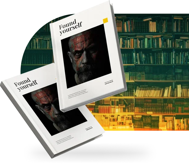









The Fear of a Cover That Looks Amateur
Most authors who try to design their own cover are not short on ideas; they are short on the specific craft skills that separate a competent cover from a professional one: controlled typography, considered contrast, and a composition that reads clearly at any size. A cover built in a general-purpose app often gives itself away through small, telling details: title text that competes with the artwork instead of sitting cleanly above it, a font chosen for looking "nice" rather than for suiting the genre, or an image that has been stretched or cropped awkwardly to fit. Readers may not be able to name what is wrong, but they register it instantly as "not quite right," and that hesitation is usually enough to lose the sale.