You’ve spent months, maybe years, writing your book. You’ve agonised over every chapter, reworked your ending four times, and finally, finally, it’s done. Then comes the moment you open a design tool or start searching for a book cover designer in Ireland, and suddenly that sense of accomplishment gets replaced by a very specific kind of dread.
Most authors know what a good cover looks like. The problem is knowing how to actually get there.
Here’s the truth: your book cover is doing more work than any other part of your publishing journey. Before a single reader opens the first page, before they read your blurb, before they check your reviews, they’ve already judged your cover. In a crowded online marketplace, that split-second visual decision is everything. A brilliant book with a weak cover will lose to a mediocre book with a stunning one. Every time.
This guide is for Irish authors who want to understand book cover design from the ground up, the psychology behind what makes a cover actually work, the practical tools and steps for doing it yourself, how to find and hire the right professional designer here in Ireland, what everything costs, and exactly what’s different about designing for Kindle versus print. Whether you’re publishing your first novel or preparing a full series, this is the most complete resource you’ll find tailored specifically to the Irish market.
Before you open Canva or start filling out a design brief, it’s worth understanding what’s happening on a psychological level when someone looks at a book cover. Because good design isn’t random, it’s intentional, and once you understand the rules, everything else becomes a lot clearer.
Your cover communicates in the first few seconds. Not through words, through feeling. Colour, imagery, and typography work together to tell potential readers, subconsciously, exactly what kind of book this is and whether it’s for them. Get that right, and you’ve done the hardest part.
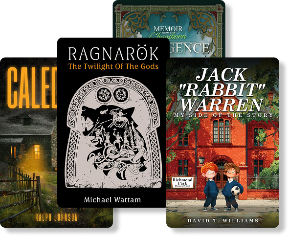
Colour is the most immediate signal. Blues and muted tones signal mystery, tension, or literary seriousness. Warm, vibrant yellows and pinks pull readers into romance. Rich, deep jewel tones work brilliantly for fantasy. This isn’t guesswork, these are associations that have been reinforced across thousands of books over decades, and readers respond to them without even realising it. Using colour to evoke emotion and match genre expectations isn’t a design trick; it’s a fundamental part of making your book findable by the right audience.
Imagery is the second major factor. The most effective covers usually centre on a single, powerful image rather than trying to show everything at once. Think of a lone figure on a fog-covered road, a close-up of a face partially in shadow, or a stark graphic symbol. That focused visual gives readers an immediate sense of tone and stakes. Generic stock photos, the kind that appear on a hundred other covers, undermine this completely. Your image needs to feel specific to your story, even if it isn’t literally depicting a scene from it.
Typography is where a lot of DIY covers fall apart. Your font choices are saying something whether you intend them to or not. An elegant serif communicates historical fiction or literary depth. A tight, aggressive sans-serif signals thriller or crime. Whimsical, playful lettering works for children’s books or cosy mysteries. Beyond style, readability matters enormously, your title and author name need to be instantly legible, both on a full-size image and as a tiny thumbnail on an Amazon product page.
One thing that doesn’t get discussed enough in the context of Irish publishing is the opportunity for subtle local resonance. Not stereotypical shamrocks or tourist-brochure imagery, but a certain visual sensibility, a colour palette, an atmospheric quality that might feel quietly familiar to an Irish reader while still reading as completely professional to an international audience. It’s a fine line, but it’s worth thinking about.
Understanding who your reader is shapes every decision above. Spend time looking at the bestselling covers in your specific genre and subgenre. Notice patterns. Then figure out how to work within those patterns while still standing out.
Once you understand psychology, the practical principles follow naturally. These are the fundamentals that professional designers apply instinctively, and that you need to understand consciously if you’re taking the DIY route or reviewing a designer’s work.
Hierarchy is about controlling where the eye goes first. On a book cover, the order is usually: main image or visual impact first, then title, then author name. You guide this using size, contrast, and positioning. If everything is the same size and the same visual weight, nothing stands out and the cover feels flat.
Contrast is what makes elements readable and gives a cover energy. Text needs to stand out clearly from whatever is behind it, this sounds obvious but it’s one of the most common DIY mistakes. Dark text on a dark background, or light text on a busy photo with areas of varying brightness, kills readability immediately. Strong contrast isn’t just functional, it creates visual impact.
Composition is how all the elements are arranged in the space. The rule of thirds, dividing your cover into a three-by-three grid and placing key elements along those lines or intersections, is a reliable starting point. Symmetry can feel elegant and formal; asymmetry creates tension and dynamism. Neither is wrong, but they communicate differently, so choose deliberately.
Colour theory goes beyond knowing that blue suggests mystery. It’s about how colours interact, whether your palette is harmonious (colours that sit close together on the colour wheel and feel cohesive) or complementary (colours opposite each other that create visual tension and energy). Both can work brilliantly depending on your genre and tone.
For typography, the practical rules are: don’t use more than two or three fonts on a single cover, make sure they complement each other rather than compete, and adjust kerning and tracking so the text looks polished and intentional rather than default. The spacing between letters matters more than most non-designers realise.
One test that every cover needs to pass: look at it as a thumbnail. Shrink it down to the size it appears in an Amazon search result. Can you still read the title? Does the main image still communicate clearly? If the answer to either is no, the design needs work before it’s ready.
Designing your own cover is absolutely possible. Plenty of authors have done it well, particularly for e-books where the production requirements are simpler. But it’s worth being honest with yourself before you start.
The case for DIY is clear: it costs very little, gives you complete creative control, and can be done quickly if you already have some visual instinct. The case against it is equally clear: there’s a real learning curve, and a cover that looks amateur will actively damage your book’s chances regardless of how good the writing is. The middle ground is this, if you’re genuinely willing to invest time in learning the principles, looking at hundreds of covers in your genre, and getting honest feedback, DIY can work. If you’re looking for a quick solution you knocked together in an afternoon, it probably won’t.
For tools, Canva is the most accessible starting point for most authors. It’s browser-based, has pre-sized templates for book covers including Kindle dimensions, and requires no design background to use. It’s not a professional tool, but it’s capable enough for a clean, well-composed e-book cover if you use it thoughtfully. GIMP is the free alternative to Photoshop, far more powerful than Canva, but with a steeper learning curve. For stock images, Unsplash and Pexels offer high-quality photography at no cost, and Google Fonts and Font Squirrel are solid resources for commercially licensed typefaces.
The step-by-step process starts with clarity before you touch any tool. Know your genre, your target reader, and the emotional tone you want your cover to convey. Look at thirty or forty covers that are currently selling well in your specific subgenre. Notice what they have in common, and then start there, not from a blank slate.
Set your dimensions correctly from the beginning. For Kindle, the standard is 1600 by 2560 pixels, which gives you a 1.6:1 aspect ratio. Build your composition around your main image first, then add your title and author name. Work on the hierarchy, make sure the most important element draws the eye first. Refine your colour palette and check that your fonts are readable at thumbnail size. Then step away from it for a day, come back with fresh eyes, and get feedback from at least three or four people who are actual readers of your genre.
Common pitfalls to watch out for: too many elements competing for attention, fonts that don’t match the genre’s visual language, low-resolution or obviously generic stock images, and ignoring the conventions of your specific category. Readers of cosy mysteries have very different visual expectations from readers of literary fiction or dark fantasy, and straying too far from those conventions without good reason will cost you.
At some point, most authors realise the professional route is worth the investment. A good designer brings not just technical skill but genuine market knowledge, they understand what’s selling in your genre right now, and they know how to create something that looks like it belongs on the shelf next to traditionally published titles.
In Ireland, there are several avenues for finding the right designer. Freelance platforms like Fiverr and Upwork give you access to a wide range of designers at varying price points, filtering specifically for Irish designers is possible on both, which can be useful if you want someone with local market familiarity or if you simply prefer working in the same time zone. Beyond the platforms, searching for design agencies and boutique studios in Ireland directly is worth doing, some specialise in publishing work and will bring a level of industry-specific understanding that general graphic designers may not have. Irish authors’ groups and publishing events are also underrated as networking resources, and word-of-mouth recommendations carry a lot of weight when you’re handing creative control of your cover to someone else.
When you’re reviewing portfolios, the key question is whether their existing work matches your genre, not just whether it looks good in general. A designer who does outstanding work on literary fiction covers may not be the right choice for your fantasy novel, and vice versa. Look for quality, originality, and whether their covers have the kind of professional market presence that makes them look at home on Amazon or in a bookshop.
The design brief is where most author-designer relationships go wrong, and it’s entirely avoidable. Your brief is the foundation of the whole project. It needs to include your title, author name, genre, target audience, a synopsis, the emotional tone and mood you’re aiming for, any specific imagery ideas you have (and things you absolutely don’t want), your colour and font preferences, examples of covers you like and dislike, whether you need an e-book cover only or a full print wrap, and your budget and timeline. The more specific and clear your brief, the fewer revision rounds you’ll need, and the better the end result will tend to be.
At Ireland Publishing House, the design service is built around exactly this kind of detailed, genre-aware collaboration. If you’re looking for professional cover design as part of a broader publishing package, including editing, formatting, and marketing, it’s worth exploring what a full-service approach looks like before you piece together separate providers.
Cost is one of the first questions any author asks, and the range is genuinely wide. Understanding what drives those differences helps you make a sensible decision based on your specific situation.
The main factors are experience and reputation, the complexity of the work (a custom illustration is significantly more involved than adapting a stock photograph), the scope of what’s included (e-book only versus full print wrap plus marketing assets), how many revisions are covered, and whether all fonts and images used require separate licensing fees.
Designing your own cover using free tools costs almost nothing unless you’re purchasing premium stock images or licensed fonts, in which case you might spend between €0 and €50. The trade-off is time and the risk of an unprofessional result.
| Service Tier | Estimated Cost Range (EUR) | Pros | Cons | Ideal For |
| DIY (using free tools & assets) | €0 – €50 (for premium stock photos/fonts) | Cheapest, full creative control, fast if skilled | High learning curve, can look amateur if not done well, time-consuming | Budget-conscious authors with design aptitude, authors testing concepts |
| Freelance Designer (Entry Level/New) | €150 – €400 | Affordable professional results, direct communication | Limited portfolio, less experience with genre nuances, may require more guidance | Authors on a tight budget seeking professional polish, straightforward genres |
| Freelance Designer (Experienced/Mid Range) | €400 – €800 | High-quality, genre-savvy designs, good communication | Higher cost, popular designers may have waiting lists | Most self-published authors seeking strong market appeal, complex genres |
| Design Agency/Boutique Studio | €800 – €2000+ | Full-service, extensive experience, marketing insight, team approach | Highest cost, less direct communication with designer, longer timelines | Authors requiring top-tier design and marketing support |
On top of the designer’s fee, you may need to budget for stock image licensing separately. Sites like Adobe Stock and Getty Images operate on different licensing models, make sure any image used commercially has the appropriate rights. The same applies to fonts: not all free fonts include commercial use rights, and using an unlicensed font on a published book cover creates legal exposure.
A few practical cost-saving approaches that don’t compromise quality: arrive at your design meeting with a thorough brief so you’re not paying for extra rounds of revisions while the concept is still being worked out; be genuinely open to the designer’s creative input rather than trying to dictate every detail; and if your budget is very tight, consider commissioning an e-book cover first and adding the print wrap later once the book has started generating revenue.
This is a question a lot of authors in Ireland are quietly wondering about, especially those coming to publishing for the first time. The short answer is: it depends entirely on your arrangement, but you should always have significant input into the creative direction of your cover.
Your role is to communicate your vision clearly, the essence of your story, its tone, its audience, the feeling you want it to evoke. The designer’s role is to translate that vision into something that’s both aesthetically strong and commercially effective. Those two things are not always identical, and part of working with a good designer is trusting their professional judgement on what will actually resonate with buyers in your genre. Being too prescriptive can limit the designer’s ability to do their best work; being too passive can result in a cover that doesn’t feel like yours.
Effective feedback is specific and rooted in design principles rather than personal taste. “I don’t like it” tells the designer nothing. “The font doesn’t convey the serious tone I was aiming for” or “the background feels too busy and it’s pulling focus from the main image” gives them something to work with. Focus on how the cover communicates to potential readers, not just on whether you personally like the colour.
Before signing anything, make sure you understand the revision process, how many rounds are included, what additional revisions cost, and what happens if you’re not satisfied after those rounds are exhausted. Also clarify who owns the final design and whether you’ll receive the source files. Owning your source files means you can make small updates in the future, adjusting your author name format, updating the back cover blurb for a new edition, without having to commission entirely new design work.
Red flags worth watching out for: a designer who is unresponsive or vague in early communications, who dismisses your feedback without explanation, who misses deadlines without flagging it in advance, or whose contract is unclear about fees and deliverables. Any of these should give you pause.
If you’re publishing on Amazon KDP, Kobo, or Apple Books, your cover is going to spend most of its life as a tiny thumbnail on a screen, and your design decisions need to account for that reality from the start.
The technical specifications for Kindle covers are a minimum of 1000 pixels on the shortest side, a 1.6:1 height-to-width ratio, and a maximum file size of 50MB. In practice, 1600 by 2560 pixels at 300 DPI is the standard that most designers and authors work to. JPEG is the most common file format for submission. Kindle Direct Publishing also offers its own Cover Creator tool, which works for very basic covers but has significant limitations in terms of design flexibility.
The key design consideration for digital is simplicity at small sizes. Intricate details, busy compositions, and small text all disappear when your cover is displayed at thumbnail size. A single strong focal point, an image or graphic that reads clearly even at 100 pixels wide, combined with a legible title is more effective than a complex composition that looks impressive at full size but becomes illegible at the scale most readers will actually see it.
One thing worth being aware of: colours can render quite differently on e-ink screens (like the standard Kindle) versus LCD screens (phones, tablets, backlit readers). What looks rich and vivid on your monitor may appear flat or washed out on an e-ink device. Testing your cover on as many different devices as you can access before you publish is always a good idea.
If you’re self-publishing on KDP in Ireland, it’s worth reading through the technical requirements on the platform directly before finalising your design. It’ll save you submission headaches later. And if you’re planning to go wide, publishing on multiple platforms simultaneously, check the specific requirements for each one, as they can vary slightly.
Print is a completely different beast from digital, and if you’re planning a physical edition of your book, there are technical specifications you need to understand before you or your designer starts working.
A print cover is a full wrap, front cover, spine, and back cover, all as a single continuous design file. The spine width depends on your page count and your chosen paper stock, and your printer will calculate the exact width for you. This is important because the spine width affects the layout of the entire cover template, so you need your final page count confirmed before the full print cover can be completed.
The back cover is your final pitch to a browser who’s already interested. It needs your blurb, a tight, compelling summary of the book that creates genuine intrigue without giving everything away, an author bio, optionally a photo, any endorsements or testimonials you’ve gathered, and in the lower right corner, your ISBN barcode. Publisher logo and pricing go here too if applicable.
For technical print specifications: your design needs a bleed of at least 3mm beyond the trim line on all edges, this is the area that gets cut off during printing, and without it you risk white edges appearing on your finished book. Your colour profile needs to be CMYK, not RGB, the same colours look very different in print versus screen, and RGB files submitted to a printer will be converted automatically, often with results that look quite different from what you intended. Resolution needs to be 300 DPI throughout, and your final file should be submitted as a print-ready PDF.
Working with Irish printers can have real advantages in terms of turnaround time, communication, and shipping costs for physical copies. It’s worth asking your designer whether they have experience preparing files to the specifications of local printers, as different print services have slightly different template requirements.
For authors who want to explore the full publishing journey, from manuscript through to final formatted and printed book, the publishing services at Ireland Publishing House cover the complete process, including formatting for both digital and print.
This section doesn’t get enough attention, and it’s one where getting things wrong can be genuinely expensive.
Every image, font, and graphical element on your book cover needs to have the appropriate commercial licence. Stock photography comes in different licensing types, royalty-free means you pay once for broad usage rights (including commercial publication), while rights-managed means your usage is more restricted and may require additional fees for certain types of use. Always check the licence for any image you’re using, even if you found it on a free resource site.
Fonts are where a surprising number of authors run into problems. Many free fonts are available for personal use only, which means using them on a commercially published book cover puts you in breach of the licence. Google Fonts and Font Squirrel are both reliable sources of fonts that include commercial use rights, but always read the specific licence for each font before you use it.
If you’re working with a designer, get clarity in writing on who owns the final cover design, whether you’re receiving all source files, and what licence you have for any stock assets used. You want to own the cover outright, with full rights to use it across all editions and formats. Don’t assume this is the default, make it explicit in your contract.
Avoid designs that are too similar to existing, well-known covers. Beyond the legal risk, it also makes your book harder to differentiate in the market, which defeats the purpose of good cover design in the first place.
Book cover design can feel overwhelming when you’re staring at it from the outside. But broken down into clear decisions, it’s very manageable, and every author who takes it seriously improves their book’s chances significantly.
Start with your genre and audience. Every decision flows from there. If you’re going DIY, invest time in studying successful covers in your category before you open any design tool. If you’re hiring a professional, build a detailed brief before you start reaching out, it’ll save you time, money, and frustration. Test everything as a thumbnail. Get feedback from real readers of your genre, not just from people who know and support you.
The cost question depends on your budget and how important the cover is to your overall publishing strategy. For most self-published authors in Ireland, the experienced freelance tier, roughly €400 to €800, represents the sweet spot of cost and quality. If you’re publishing a series or investing in a significant marketing push, the higher tier may well be worth it. If you’re genuinely budget-constrained, a well-executed DIY cover for your e-book launch is not a permanent decision, you can always commission a professional cover once the book starts generating income.
If you’re planning to do more with your book than just design a cover, if you want professional editing, formatting for both digital and print, and a marketing strategy behind the launch, it’s worth understanding what an integrated publishing approach looks like. Ireland Publishing House offers all of these services in one place, designed specifically for the Irish market.
And if you haven’t sorted your manuscript yet, it’s worth reading through resources on how to publish your book in Ireland and the cost to self-publish in Ireland before you get to the design stage, knowing what the full picture looks like makes every individual decision easier.
One final thing worth saying: if you’re planning a series, think about your cover design as a system from the beginning. A cohesive visual identity across multiple books builds recognition, communicates professionalism, and makes marketing significantly easier. Series branding is much harder to retrofit than to build from the start.
Your book deserves a cover that represents it properly. Not one that’s good enough, but one that makes someone stop scrolling and click.
There is something about a well-illustrated children’s book that stays with you long after you’ve grown up. You might forget the exact words on the page, but you remember the pictures. The wild, scratchy monsters. The colours that didn’t quite follow the rules. The faces that made you laugh before you even understood what was […]

If you’ve ever picked up a book because the cover caught your eye, you already understand why this matters. A great cover doesn’t just look lovely sitting on a shelf. It does real work. It tells a reader, in about three seconds, whether your book is worth their time. For Irish authors and publishers, there’s […]
You’ve spent months, maybe years, writing your book. You’ve agonised over every chapter, reworked your ending four times, and finally, finally, it’s done. Then comes the moment you open a design tool or start searching for a book cover designer in Ireland, and suddenly that sense of accomplishment gets replaced by a very specific kind […]

So you’ve got the manuscript. Or most of it, anyway. The dream is real, the words are written, and now you’re staring at the very practical question that every Irish writer eventually hits: how much is this actually going to cost me? The cost of self-publishing in Ireland isn’t one fixed number. It shifts depending […]

So you’ve written something. Or you’re very close. Either way, you’re here because you want to know what actually happens next. How do you take a manuscript and turn it into a proper, published book that people in Ireland (and beyond) can read, buy, and recommend to their friends? Here’s the thing nobody tells you […]

Let’s be straight about something. You spent months, maybe years, writing your novel, screenplay, or research paper. And now, someone is asking you to cram the whole thing into one or two pages. And make it compelling. And reveal the ending. And somehow not make it sound like a school report. No wonder writers find […]

There’s a moment every writer knows. You’re mid-sentence, and suddenly you hit a pause — a break — a connection between two ideas, and you hover over the keyboard wondering: is that a hyphen? An en dash? An em dash? You pick one, slightly uncertain, move on, and quietly hope no one notices. The uncomfortable […]
We guide you through the publishing process in clear, simple steps, so you always know what is happening and what comes next. Your work is kept fully confidential, your feedback is taken seriously, and nothing moves forward without your approval. Our role is to remove confusion, protect your work, and make sure your book is completed properly and professionally.