If you’ve ever picked up a book because the cover caught your eye, you already understand why this matters. A great cover doesn’t just look lovely sitting on a shelf. It does real work. It tells a reader, in about three seconds, whether your book is worth their time. For Irish authors and publishers, there’s something even more powerful at play because Ireland has a visual identity that readers around the world recognise and feel drawn to.
This guide walks you through everything you need to know about designing an Irish-themed book cover, whether you’re doing it yourself or working with a professional. We’ll cover Kindle covers, print covers, costs, illustration styles, and the small details that tend to make the biggest difference.
Before you open any design software, it helps to think about what “Irish” actually looks like on a cover. It’s not just slapping a shamrock on the front and calling it done. The strongest Irish-themed covers draw from a deeper visual language.
That includes Celtic knotwork and patterns, which carry centuries of meaning and have a timeless quality that works across genres. It includes colour, most obviously the deep, saturated greens that feel rooted in the Irish countryside, but also gold, rich navy, and the cool greys of stone and mist. It includes typography that nods to Gaelic heritage without being so ornate it becomes hard to read. And it includes landscape, the cliffs, the bogs, the ancient ruins that give Irish stories their particular atmosphere.
These elements work because they carry emotional weight. They suggest mystery, heritage, nature, and something slightly otherworldly. That combination is genuinely useful across many genres, from fantasy and historical fiction to romance, travel writing, children’s books, and even certain kinds of literary fiction.
If you’re curious about the broader publishing journey alongside your cover design, the team at Ireland Publishing House covers everything from concept to finished book.
Kindle covers have specific requirements and it’s worth knowing them before you start designing. Amazon’s recommended size is 2560 x 1600 pixels with an aspect ratio of 1.6:1. That might sound technical but it’s simply about making sure your cover looks sharp on every device, from a big tablet screen down to a small phone thumbnail.
That thumbnail point matters more than most people realise. Your cover will appear at a tiny size on Amazon’s browsing pages, and if the title becomes unreadable or the main image turns into a blur at that size, you’ve lost potential readers before they even click through.
Once your canvas is set up, the next decision is what kind of Irish feel you’re going for. There are a few distinct directions worth considering.
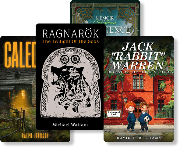
Celtic fantasy leans into the mythological side of Ireland. Think deep greens and golds, intricate knotwork borders, and imagery drawn from folklore, fairies, druids, ancient warriors. This works brilliantly for fantasy novels and mythology-based stories.
Irish countryside focuses on landscape, the Cliffs of Moher, rolling green hills, misty mornings, ancient castles. This suits historical fiction, romance set in Ireland, and travel writing.
Minimalist Irish design strips everything back to one or two strong elements with plenty of breathing room. A single Celtic motif, a bold green palette, clean modern typography. This approach often performs surprisingly well on Kindle because it stays readable at small sizes.
Historical Ireland uses aged textures, vintage typography, and imagery from specific periods of Irish history. Sepia tones and muted colour palettes tend to work well here.
Font choice is where a lot of self-designed covers go wrong. Using an overly decorative Gaelic-style font for both the title and your author name often ends up looking cluttered and hard to read. The better approach is to pair one expressive display font, something with Celtic character, with a cleaner, more modern font for secondary text.
Always check that your title reads clearly at thumbnail size. If you have to squint to read it when the image is small, the font is either too thin, too ornate, or too small.
Some Irish-themed colour pairings that tend to perform well on digital covers include deep green with gold accents, dark green with black backgrounds for a more dramatic effect, and white or cream with emerald as a fresh, lighter alternative. Whatever combination you choose, make sure there’s enough contrast between your text and background. Low contrast is one of the most common mistakes in DIY cover design.
Cost is one of the first practical questions authors ask, and it varies quite a bit depending on what you need.
A basic design, typically using stock imagery with some customisation, generally runs between €50 and €150. This can be a reasonable option for authors on a tight budget, though the results tend to look more generic.
Professional cover design, where a designer creates something tailored to your book and your market, usually falls between €150 and €500. This typically includes a few rounds of revisions and proper market research for your genre.
Custom illustration, where an artist creates original artwork rather than using stock images, starts around €500 and can go significantly higher depending on complexity and the illustrator’s experience. For certain genres, particularly children’s books and fantasy, this investment often pays off.
What affects the cost most is the level of custom work involved, how experienced the designer or illustrator is, how many revisions are included, and whether they’re doing any research into what’s working in your particular genre right now.
It’s worth knowing that a professionally designed cover consistently outperforms a poorly designed one in terms of sales, so this isn’t always the best place to cut costs. If you’re weighing up your overall publishing budget, the cost of self-publishing in Ireland guide gives a useful broader picture.
An illustrated cover uses original artwork created specifically for your book rather than stock photography or composite images. The result is something that can’t appear on anyone else’s book because it was made for yours alone.
Illustrated covers are particularly well suited to children’s books, fantasy novels, mythology-based stories, and any book where the visual world of the story is central to its appeal. For children’s books especially, illustration is almost always the right choice.
Watercolour landscapes have a soft, dreamlike quality that suits Irish countryside settings beautifully. Celtic fantasy art is bold and detailed, ideal for mythology and fantasy. Minimalist vector illustration is clean and modern while still carrying strong visual identity. Storybook-style drawing is warm and inviting, perfect for younger readers.
When you’re looking for an illustrator, ask to see their portfolio in genres similar to yours, and have a conversation about whether they understand the cultural references and visual traditions you want to draw from.
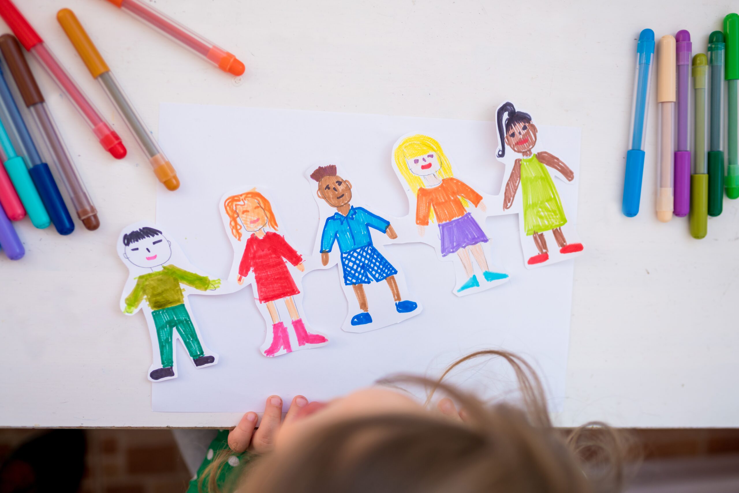
Children’s covers follow different rules from adult fiction covers, and getting those rules right matters a great deal.
Young readers, and the adults buying books for them, are drawn to bright, bold colours. Characters need to look friendly and expressive. Typography should be large and clear, never fussy or decorative to the point of difficulty. The overall feeling should be joyful and inviting.
For Irish-themed children’s books, there’s a wonderful range of visual territory to explore. Leprechaun characters done with warmth rather than cliché, magical forests in vivid greens, talking animals in distinctly Irish settings, folklore creatures that feel friendly rather than frightening. The key is always emotion. A child should look at the cover and feel immediately curious and happy.
Bold fonts work better than delicate ones. Simple layouts with one main character or scene work better than busy, crowded compositions. And whatever you put on the front should make the child want to know what happens inside.
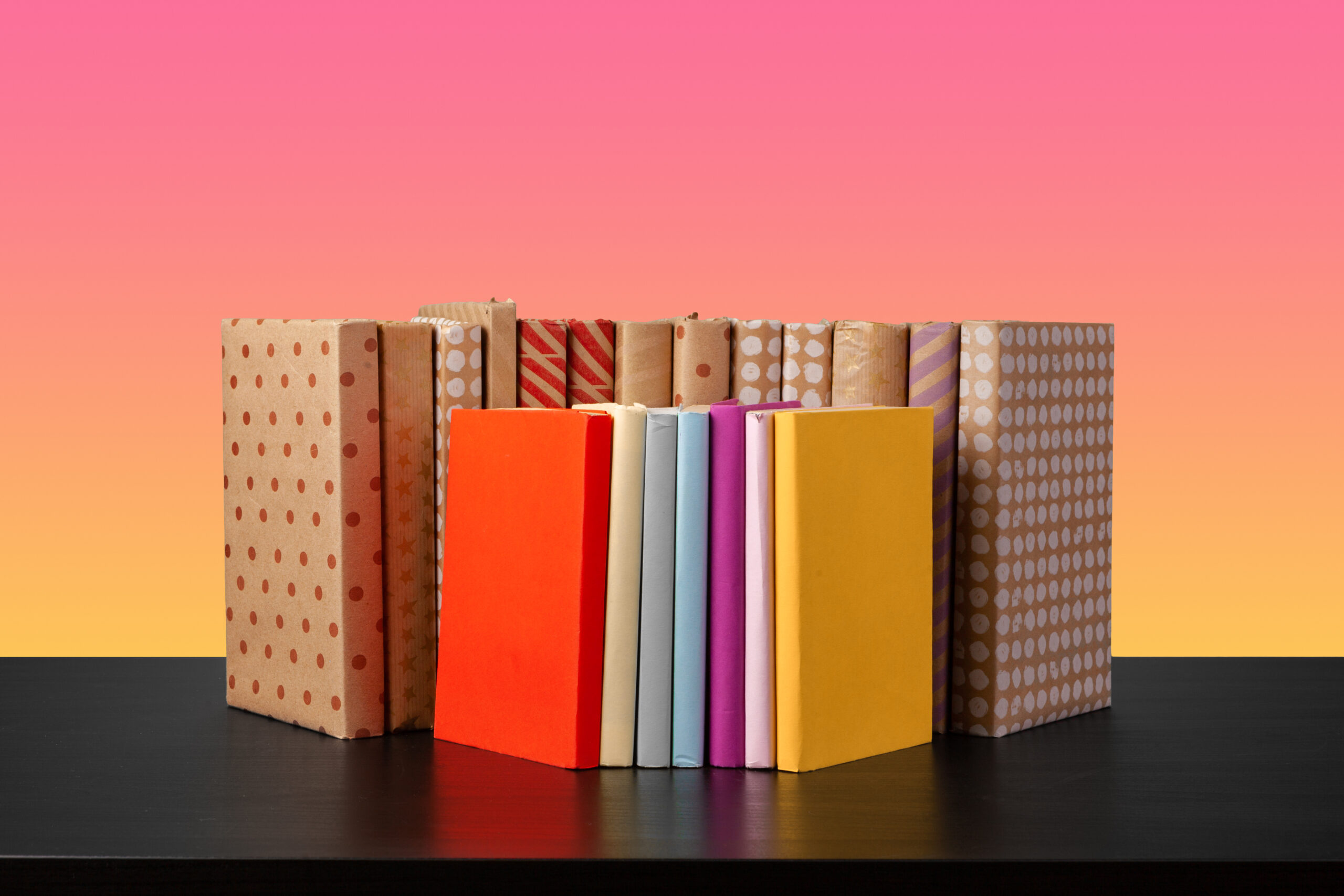
If you’re publishing a print book, your cover is actually three connected pieces and they need to work together as a whole.
The front cover carries the title, your author name, and the main visual. This is what most people focus on, and rightly so. The spine needs your title and author name clearly readable when the book is sitting on a shelf. Publisher logo usually goes here too. The back cover has your blurb, a barcode, and often a short author bio.
What makes a full cover feel professional is consistency. The same colour palette, the same typographic style, the same overall feeling running from front to back. Using a grid system to align everything helps, and it’s worth taking time to check how the spine text reads at scale, as this is often where print covers fall apart.
The design services at Ireland Publishing House cover full print cover production including spine and back cover layout.
Canva is the most beginner-friendly option and has templates you can adapt. It won’t give you the same level of control as professional software but it’s a reasonable starting point. Adobe Photoshop is more powerful for compositing images and detailed editing. Adobe Illustrator is best for vector-based work where you need elements that scale perfectly.
Start by looking at other covers in your genre. Not to copy them, but to understand the visual language readers in that genre expect. Genre conventions exist for good reasons, and breaking them without understanding them tends to confuse readers rather than intrigue them.
Sketch your layout before going digital. Decide where your title sits, where your main image goes, and roughly how much space your author name takes up. Then design digitally, test how it looks at thumbnail size, and ask other people for honest feedback before finalising anything.
Too many fonts is one of the most common problems. Two fonts, used well, are almost always better than four. Using low-resolution images is another frequent issue, anything below 300 DPI for print or the full 2560 pixels for Kindle will look soft or pixelated. Overcrowded layouts where too many elements compete for attention also hurt covers significantly. And ignoring genre conventions, designing something that looks beautiful but doesn’t signal clearly what kind of book it is, tends to reduce click-through rates even when the design is technically accomplished.
There’s more detail on the full process in this guide on how to design a book cover in Ireland.
History books benefit from covers that feel rooted in their period. Aged textures, parchment effects, vintage typography, and imagery drawn from the specific era all help signal to readers what they’re getting. For Irish history in particular, themes like ancient Celtic culture, medieval castles, and significant historical periods offer rich visual material. Sepia tones and muted palettes reinforce the sense of time and place without looking dated.
Academic book covers work differently. They need to feel authoritative and clear above all else. Clean layouts, professional typography, minimal decoration, and structured composition are the marks of a well-designed academic cover. The goal is credibility, and anything overly decorative can undermine that. Clarity and professionalism are the two most important qualities to aim for.
Looking at covers that consistently perform well, a few patterns show up reliably.
Simplicity tends to win. Strong covers usually have one clear focal point rather than several competing elements. Emotional impact matters, the best covers make you feel something before you even read the title. Clear genre signalling helps readers immediately understand what kind of book they’re looking at. And contrast, both visual and typographic, makes everything more readable.
Less is genuinely more in most cases. The covers that tend to underperform are usually the ones trying to say too many things at once.
The Irish publishing market, like the broader global market, is moving in some clear directions this year.
Minimalist Irish designs continue to grow in popularity, combining cultural identity with clean, contemporary aesthetics. Bold typography is increasingly used as the primary visual element rather than just supporting text. AI-assisted illustration is becoming more common in the design process, particularly for generating initial concepts, though custom human illustration remains the gold standard for final covers. Nature-inspired visuals, landscapes, plant life, natural textures, are particularly strong right now in the Irish market.
Looking slightly further ahead, digital covers are beginning to incorporate motion elements for eBook platforms, and personalised cover variations for different markets are becoming more feasible for publishers with the right tools.
Designing a cover is only one part of bringing a book to market. The team at Ireland Publishing House works across the full publishing journey.
Their editing services help tighten manuscripts before they reach readers. Ghostwriting and fiction ghostwriting support authors who need help developing or completing a project. Formatting services ensure the interior of your book looks as professional as the cover. Marketing support helps get finished books in front of the right readers. And their publishing services bring everything together from manuscript to finished product.
If you’re earlier in the process and still working on your manuscript, the guides on how to write a synopsis and how to publish your book in Ireland are useful reading alongside this one.
Your book cover is doing serious work before a single reader opens page one. It earns attention, signals genre, and tells the reader whether your book is worth trusting. Getting it right is worth the time and, where needed, the investment.
Ireland’s visual culture gives authors something genuinely special to work with. Celtic heritage, landscape, folklore, and a distinctive colour identity that readers recognise the world over. Whether you’re designing your own cover or working with a professional, understanding what makes Irish-themed design work well will help you make better decisions throughout the process.
The best covers look effortless. Behind that effortlessness, there’s usually a good deal of thought about genre, audience, visual hierarchy, and cultural resonance. Take the time to get those foundations right, and the rest tends to follow.
There is something about a well-illustrated children’s book that stays with you long after you’ve grown up. You might forget the exact words on the page, but you remember the pictures. The wild, scratchy monsters. The colours that didn’t quite follow the rules. The faces that made you laugh before you even understood what was […]
If you’ve ever picked up a book because the cover caught your eye, you already understand why this matters. A great cover doesn’t just look lovely sitting on a shelf. It does real work. It tells a reader, in about three seconds, whether your book is worth their time. For Irish authors and publishers, there’s […]
You’ve spent months, maybe years, writing your book. You’ve agonised over every chapter, reworked your ending four times, and finally, finally, it’s done. Then comes the moment you open a design tool or start searching for a book cover designer in Ireland, and suddenly that sense of accomplishment gets replaced by a very specific kind […]

So you’ve got the manuscript. Or most of it, anyway. The dream is real, the words are written, and now you’re staring at the very practical question that every Irish writer eventually hits: how much is this actually going to cost me? The cost of self-publishing in Ireland isn’t one fixed number. It shifts depending […]

So you’ve written something. Or you’re very close. Either way, you’re here because you want to know what actually happens next. How do you take a manuscript and turn it into a proper, published book that people in Ireland (and beyond) can read, buy, and recommend to their friends? Here’s the thing nobody tells you […]

Let’s be straight about something. You spent months, maybe years, writing your novel, screenplay, or research paper. And now, someone is asking you to cram the whole thing into one or two pages. And make it compelling. And reveal the ending. And somehow not make it sound like a school report. No wonder writers find […]

There’s a moment every writer knows. You’re mid-sentence, and suddenly you hit a pause — a break — a connection between two ideas, and you hover over the keyboard wondering: is that a hyphen? An en dash? An em dash? You pick one, slightly uncertain, move on, and quietly hope no one notices. The uncomfortable […]
We guide you through the publishing process in clear, simple steps, so you always know what is happening and what comes next. Your work is kept fully confidential, your feedback is taken seriously, and nothing moves forward without your approval. Our role is to remove confusion, protect your work, and make sure your book is completed properly and professionally.